Tips to make your videos stand out and make them better:
If you are online for any amount of time, chances are you’ve clicked on something that led you to a sales video. Typically, it’s a funnel or landing page that makes you watch a video and then enter your email to get access to the product or download. You click on the video and start watching and sure enough, it’s a plain white background with words on the screen and the voiceover is reading the text to you verbatim.
Stop doing this.
A little background on me is necessary before moving on to my point. I worked for a global telecom company for 15 years in the training division. We were responsible for training the employees. Most of our training was centered on the retail environment. We trained adult learners all day every day. Typically, we were delivering training in a compressed time frame, i.e., a retail employee holding a tablet in the store has some downtime, so they jump into a training module and take some quick training.
Compressed time frame…similar to watching a sales video online no?
This does come with the acknowledgement that online video does not directly correlate to training, but at the end of the day, clarifying your message is the name of the game. Simplify and dilute your message down to the key takeaway you want your viewer to get from your video.
Here’s my point.
People are getting oversaturated watching videos where there is a voice-over reading the text on screen verbatim. If you’re taking this approach to your videos….stop it and stop it now! Here’s why….
Let’s look at it through the adult learning lens.
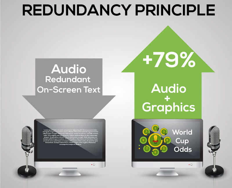
When you read your text on screen and then narrate it, the retention rate of your content actually goes down. In fact, it decreases by 79%. [1] 79%. Let that number sink in for a bit. That’s well over half of your content that the end user is not retaining. As we all know, that’s not a good number. The Mayers Cognitive Theory of Multimedia learning states that people learn better from animation and narration than from animation, narration and on-screen text.
Why does this happen?
- You are increasing cognitive load. The majority of people watching your video will be able to read through all the on-screen text by the time you have narrated the first sentence.
- It’s distracting and ultimately clouds your message. While I am reading what you wrote, your voice is just static, extra noise in the background. The viewer can only process one thing visually at a time. If there is a wall of text on screen and accompanying audio, you have overloaded them.
Video producers may argue that including redundant, on-screen text offers a way to accommodate both visual and audio learning styles. There isn’t any evidence out there that this approach works. Additionally, most major online video services have an option for CC that the user can choose to activate if they need it.
Ok, Scott, I’m on board now, so what I can I do to make my videos better?
When it’s done well, I call it the “Mercedes-Benz Effect”. Most of the luxury car commercials have footage of the product (the car) and then will highlight a feature – something like the word “Performance” written in text, fading across the screen. So even if the sound is muted or lower, you still get the takeaway message without all the other supporting language written on screen. Try to pattern your videos after these types of commercials. Remember, they only have 30 seconds to get their message to you, so they have to be on message, clear and concise.
Another example I can give for inspiration on how to make your videos is David Hogue. PhD. https://www.youtube.com/watch?v=zaeGuPT1m2o
Watch a few minutes of his presentation. Notice how he has graphics and minimal text on screen when he’s talking. And when he uses bullet points, he’s not reading them verbatim (with some exceptions).
The takeaway is this: you don’t need to put every single word on screen.
Checklist to make your videos better:
1) Use an outline to determine what key points you want to communicate.
Pull out a word or phrase that you want to highlight
2) Plan your video and the progression of your video.
3) Write a script. Read it out loud and time it out.
4) Choose a few relevant images that do a good job of visually representing your content.
5) Choose the keywords or phrases you want to highlight on screen.
5) Use bullet points in lieu of big blocks of text. We don’t want a wall of text here J
6) When you produce your video or if you have it hired out, use storyboards to determine when and where you want to drop key phrases into your video. Consider the pacing and the rhythm of your visuals as well. Instead of dropping a graphic every 20 seconds in a predictable manner in your video, try varying the pace.
A pattern of short – short- long – short animation styles is an example.
Hopefully, this gives you some good tips to help the retention of your content as well as giving you a way to stand out from your competition. Now go forth and make some great videos.
- Clark, R. C., and R. E. Mayer. E-Learning and the Science of Instruction, 2nd edition (San Francisco: Pfeiffer, 2007).
- Mayer, R. E., “Introduction to Multimedia Learning,” in R. E. Mayer, Ed. The Cambridge Handbook of Multimedia Learning (New York: Cambridge University Press, 2005).


[…] post How to Make Better Videos And Get Better Content Retention appeared first on […]
[…] post How to Make Better Videos And Get Better Content Retention appeared first on […]
Scott,
I agree with you, just having the text appear on the screen doesn’t do anything for retention – or connection. I believe it’s important for viewers to see YOU. Video is great for getting people to know, like, and trust you. But that have to see you to do it. Words flashing by on a screen sync’d to a narrated script just wont cut it.
I’d rather have an authentic video from a real person than an animated one any day.